Wednesday, 30 May 2012

Final Evaluation


This module has been very hard but also very rewarding. I have learnt lots through being in the studio everyday, discussing, showing and evaluating my work and the work of others. Having this constant discussion makes briefs come to life through other peoples enthusiasm and encouragement. The yearbook was a bit of a learning curve in the way of organising, photographing and getting the book ready for the printers. But I am very happy with how the collaboration went. The people in the group all had elements of their personalities and design skills which blended well together. It was a real eye opener into how a design group can make a project really successful. Before this experience I was never 100% happy with collaboration projects so this has made the future seem brighter as colloborations are how most studios work. The yearbook made me realise that design is more to do with people than you anticipate. The yearbook proved hard as you had to please the tutors, the students, the design team and your self. But through discussion and perseverance I think everyone is happy with the result. Organising content for the yearbook was a difficult as you were forever chasing up people for different files, copy and information.

Other projects that have gone successfully in this module that have furthered my understanding and passion for packaging / branding design were the Papa Loko rum brief and the Quentin Tarantino brief. I think I enjoyed them because they both had strong concepts behind the design. They were different concepts, but having one there brings out better ideas which create more interesting resolutions. Both of them have pushed my understanding of materials and techniques to create interesting design. In this module I found that through my DC publication and development on my own work I have decided I want to design more for high end, high spec, concept led and bespoke work. This rather than boring commercial stuff really excites me and when you have passion for something you try harder so you get better design at the end of it. Doing the Ocean Giants project, Yearbook and DC publication I have definitely got a better understanding of layout. I hadn’t really touched on this area of design before FMP but I think the skills I have learnt about type, grids and layout are invaluable. Although this part of graphic design isn’t my strongest I feel that the skills I have learnt are sufficient enough to get me by. For some of the briefs I felt if I had more time I could of expanded them further, pushing ideas and resolutions but sometimes there can never be enough time for a project and deadlines can be a good thing. As for the time management side of things I think I organised my time well enough considering I had a 2 week placement. Overall this module has built my confidence and competence as a designer which is good as this is what I came here to do.

Tuesday, 29 May 2012

Slytones Boards


Penguin Boards


Quentin Tarantino Boards


Ocean Giants Boards


Yearbook Boards


Papa Loko Boards


Brief 6 - Slytones Evaluation

This live brief was a different way that I usually work, but I think it is more of what a brief is in reality as I was trying to visualise what the client wanted rather than what I wanted. I always enjoy designing for music because you can listen to the music and communicate what the music is like in a visual way. The client wanted a illustrative resolution which was I enjoyed doing because illustration is a passion of mine which I sometimes don't utilise in some of my other briefs. Sometimes working with a client can be fristrating becuase they are set on ideas that you think won't fit with the design. This was one of those cases as the client wanted design elements and colours that didn't work together so the end result isn't how I would of made it if it was my own.

Brief 5 - Penguin Evaluation

I think the final resolution worked well for this brief. I think the concept of the design was well considered as I actually read the book so I had a real knowledge for the characters and feel of the book. The colour palette I used worked well and I think is something that I sometimes don't spend long enough thinking/experimenting enough on. But this brief the colours complemented the design and story. Unfortunately I wasn't a winner of the brief. I think I over looked the fact that penguin books love a more of a worn and hand made look to their book covers where mine was very clean cut and vector based.

Brief 4 - Quentin Tarantino Evaluation

I thought this brief was one of the strongest because the resolution is appropriate for the target audience of Tarantino fans. The packaging references to the films would appeal to the Tarantino fans like the suitcase in pulp fiction idea. There was a lot of crafting involved in this project which I enjoyed and executed well. I think the use of colour was well considered and worked well. It communicated a range and are appropriate to Tarantino style. I was hoping to have more to put in the DVD boxset briefcase to make it seem more like a special boxset. Things like postcards and posters. I sort of did this with the documentary packaging part of the project but I feel I could of pushed the deliverables even further.

Brief 3 - Ocean Giants Evaluation

This projet was a bit of a learning curve for me as I had never produced a full book. Although the layout of the book works I don't feel its the strongest design I have ever done. There is far more exciting and innovative layout out there and I don't think this would keep up with the competition. Saying that the target audience for the book won't be looking for innovative layout, they would be interested in the photography and facts about the animals which I think I communicated well. The info graphics with in the book tie it all together and make the whole publication a success. I think this brief has improved my layout and infographic skills which is why I wanted to do this brief in the first place.

Brief 2 - Yearbook Evaluation

This brief was the most time consuming of the lot as you had to speak to everyone, chase up people for files and information and organise everything. Because the concept of the yearbook included categorisation of everyones work it made for a more complicated method of gathering and photographing everyones work. But it was worth it because the final piece has worked out very well and is different to any other yearbook produced. Through this brief I have learnt so much about photography. We did two main shoots. The portrait and the work shoots. Through both I have gained an invaluable amount of knowledge about lighting, set ups, photo editing, cameras and how to arrange compositions to create great photos. For the first time in a collaboration I am 100% happy with the resolution. I think everyone gave something to the group making it a fun and productive collaboration. There should of been more of a dialogue with the tutors about concepts and design ideas which is something that we could of worked on better as sometimes I think because there was a constant discussion between the design team we assumed/forget to tell others.

Brief 1 - Papa Loko Evaluation

This brief is something I have wanted to try for a long time, which is to create a high end, well crafted and bespoke alcohol packaging for a rum or whiskey. This brief started out as a research led brief as I had no idea what my rum concept was going to be. I went thtough different tangents and different ideas to do with the Caribbean were Rum originates from including Naval, Pirates etc. But eventually I decided to focus my concept on Voodoo which is a large religion in the Caribbean especially Haiti. After a wave of design ideas I lost passion for the project. I was happy with the concept but I couldn't create anything that was doing it for me. I think I wasn't being adventurous enough. But after I tried again later I started again and went down a more hand rendered approach and the resolution came together well. Because there were problems with this brief I think that I had to think and design in a different way and that is why the resolution turned out different and decent.

Monday, 28 May 2012

Board Tests

Printed out the boards in B&W as a test to see what changes I needed to do. It helped as I made some changes.


Distillery


As the Papa Loko brand has all these different routes I thought it would be appropriate to give the distillery an identity also. The distillery is based in Port-Au Prince which is the Capitol of Haiti. The design uses elements from all the different Papa Loko product designs.

Notting Hill Promotion

As further promotion the Papa Loko could be sold and given out in secial Papa Loko plastic cups which would be seen throughout the festival.

Another promotional idea is to give out these Papa Loko masks at the carnival which would fit in with dressing up at the carnival.

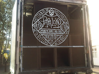
Notting Hill


I think Notting Hill Carnival would be a perfect place to promote the Voodoo based rum. The carnival is very similar to others in the caribbean so the blended rum would suit perfectly.

Papa loko could sponsor it and have its identity on the street speakers that are dotted around playing the suit sounds of teh Caribbean (or dub step)


Promotion

I thought that a good way of promoting the rum brand is by applying the logo on a grand scale onto pubs or clubs.

Attaching Booklet

Was looking at different ways how to attach the booklet. Tried using a black sticker so it hung nicely down the side. I think i should just hang it round the neck, other wise it looks too forced.

Booklets

Printed out the booklets and bound them with thinner string giving a more authentic hand made feel.

Test

Printed out a test piece for the booklet. I realised that the hole punch made it a bit cheap and the string was too thick.


Ginger book

Same as the rum I made a little booklet for more info about the Papa Loko product.

Ginger Beer

the final ginger beer logo and the bottle. I used candle wick and tied it round the neck to make it seem similar to the wax seal on the rum but gives it a softer feel to make it apparent that it is a soft drink. 


Waxes

For the different rums I would propose for the different blends to have different colours waxes to show the difference in the range.

Ginger Beer


I decided to expand the brief to produce Papa Loko ginger beer which is a fantastic mixer with rum. Here are some development ides for the logo. I wanted to keep it similar to the rum logo so the brand keeps its identity.

Promotion

Drink matts could be used for promotion in bars and pubs which show the different Caribbean blends and the blurb about Papa Loko


Other Rums

The Papa Loko brand could also make other Caribbean blends which I developed after looking into other caribbean dishes such as the 'Accra' and Arasan'. These are very popular in Haiti. 

The other blends are White coconut rum and Dark Cinnamon Rum.
So there is now a white, dark and golden rum to the Papa Loko set.


I was going to have different logos for the skulls to represent different flavours but I thought it would make the branding less apparent and also cinnamon just looks like lines. Below is an attempt at coconut trees.


Booklet

As the bottle doesn't lend its self to another label as it would ruin the look of it I decided to try a little booklet with more information and the standard stuff you need with an alcohol project inside.

Friday, 25 May 2012

Big Logo

Mount Gay Rum painted their logo on their distillery which I think is cool. I may try something similar with the Papa Loko Distillery.

Printed Publication

I went for the simple black dot on the front cover and the other information down the spine. The print came out ok. some little issues with the cutting but it has turned out good.


Tuesday, 22 May 2012

Sideboards

Design and copy for the sideboards. I think that the design matches the voodoo feel of the product.


Boarder

Sketched out some ideas to give the info more of a boarder similar to the label. The bottle looks much better with side boards. Makes that rum look golden,


Type sideboards

I think the type on the side needs more work the right side looks a bit sparse and the left side looks better without the logo. I think I need to incorporate something more that is similar to the the logo design,

Mock ups


I tried different stock in the back boards to see how it would react to the bottle. But the sideboards worked much better as it let in more light.

Sideboards

I thought originally that the back board in the box would be best as a place to put more information and give the packaging more of a branded feel.

223 mm x 105 mm


But I then tried the side boards again and it let the light through more which made the rum really glow. 223 mm x 90 mm

Sunday, 20 May 2012

DC Cover


Dc Publication

Sealing Wax Baby

After hours of working out how best to melt and apply the wax I finally got it looking good. It gives the bottle design an extra edge and the black was gives it a proper voodoo feel.

Thursday, 17 May 2012

Bottle Shots

Looking at different ways to shoot bottles. I will experiment with birds eye view shot but I think the classic front on, maybe a little looking up at the bottle will be a winner.


Label

I cut out the design on white vinyl down stairs on the vinyl cutter. I then removed all the bits I didn't need then stuck it to masking tape then onto the rum bottle. I think it has turned out very well and the design really sings when its on the bottle.


Wednesday, 16 May 2012

Bottle mock up.

Different colours for emblem. The gold looks good but may be too 'Aztec' the white really pops and I think works well against the brown of the rum.


Emblems

Design dvelopment for emblems. The one above is when I printed out the best design/ layout of type and then traced over it to give more of a hand made feel to it.

Papa Logo


Papa Loko Emblem

Sketches developing a emblem for papa loko.