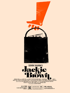
As part of my range I have designed a poster that people could put on their wall. It is similar to the Blue whale information graphic but with more information and detail like the world map in the background.
Monday 30 April 2012
Friday 27 April 2012
Vector Titles
I made / luckily found vector files of the Tarantino film titles. I want to have the original type faces from the films because each film has its own personality and look so giving each film the same type face I think would kill of the the character of each film.
Tarantino Album
I thought the 'blood' splattered style worked well with this album cover. The 'the' within the 'T' also is a cool touch.
Book Mark Designs
Designing book marks. I added a quote from McMurphy which I think works. The ones with just the cogs I think would look good as a book mark.
Big Kahuna
I made a vector to use for the part of the packaging for the dvds. The Big Kahuna burger logo. As seen on my DC blog HERE
Cover design
I added a quick explanation the supplement which I felt it need if it did fall out of the paper. I also made the colour a smaller strip to give the image more impact.
Supplements Design
I gave white space to the design to reflect the book cover design. I also made the chapter colours smaller and gave a little information on whats "inside"
Visiting Professionals
For the VP pages we sent out forms asking 4 questions, what does the ideal student need, Why do you love design, Three words to describe your time on the course and what inspires you.
Thursday 26 April 2012
Final Book
This is the final book. I think I have done well with creating a contemporary book design that would entertain, educate and amaze people about whales.
Submission Cover
Final Cover Ideas
The colours below (apart from the red) I think are working. I added a doorway behind the Chief to represent a hallway and adding marks up the wall communicates a corridor. I think the water dripping down the front works with showing the 'inner workings' of the hospital. I cant decide between the brown and blue and the yellow. Yellow is the colour of madness and It does create a more vibrant and visually appealing front cover.
The spanner with in the cogs represents McMurphy who in the book is the spanner in the works of the hospital. He riles up Ratchet and switches things up in the hospital.

Corridor
Cuckoo Colours
The design is working, but the colours I am using aren't working that well. I also think I need to develop the hall way to make it seem......more like a hallway.
Cuckoo Cover
Cuckoo Ideas 2
Exploring the type face I produced with an Idea I had of using a Cog and an eye communicating the machine of the hospital with the Nurse looking over the patients.
Type For Cuckoo
Cuckoo Ideas
Starting to design the cover. I was thinking of trying to have big simple shapes on cover. But after doing some designs I think there should be more detail which will make the design POP.
Hand Type
Did some hand drawn type for the cover. I think a font that is a bit messy will communicate the madness of the characters in the book.
Idea Sketches
Thornes Brighton
Thornes in Brighton utilised their building when branding the food store. The large building number and white type on the grey blue makes the whole place stand out.
Front Cover Mock up
Initial Sketches
Wednesday 25 April 2012
Halftone
Some more examples of use of halftone.
top - Typography with a big gap between each dot. Makes it look more rough, I think thats what I want to got for. Something more hand made sorta feel.
Bottom - Very subtle use of half tone blended with solid lines. Looks more slick and computer-fied where as I want a hand rendered look almost screen print like, imperfections etc.
Tuesday 24 April 2012
Hand drawn Type
I think the book cover would work well with some hand drawn type as the looseness of hand drawn style resonates with the characters in the book.
Visiting Peeps
I was in charge of scanning in all the signatures, organising and giving them colour.
Visiting Professionals
Visiting Staff
Hand writing
To communicate a sense of personality and interaction of the course we thought of having the tutors write down their name in their hand writing. It shows more personality rather than a typeface. We thought the red really popped from the orange and the double page spread of this would look sick.
Then we decided that we could use the hand writing idea for everyone in the yearbook. Below are all the students.
Monday 23 April 2012
Sunday 22 April 2012
Supplements
As part of my brief I want to design the covers of supplements that would be part of a weekly realise to promote the release of the book or programme. The supplements would come with the theguardian. I have tried to involve the colours of the different chapters in the book which the supplement would give a taster of.
Ocean Giants Front Cover
Here are my design Ideas for the Ocean Giants publication. I started of using simple vector shapes but I realised that a real BBC book would use this style and I went on to use photography with subtle use of type. I think the designs towards the end work better with the amazing image of the humpback. I think the white space helps complement the vivid blue and also is consistent with the generous white space through out the book.
BBC BOOKS
Researching into BBC books, found they all have the BBC book logo which I found. Other examples of BBC books.
Friday 13 April 2012
Photography
This is a good example of what we want in the way of composition when we do the photography for everyones work. A birds eye view shot and also a diagonal shot which shows the range of a project.
Subscribe to:
Posts (Atom)


