
Showing posts with label Brief 6 - DP. Show all posts
Showing posts with label Brief 6 - DP. Show all posts
Tuesday, 29 May 2012

Brief 6 - Slytones Evaluation
This live brief was a different way that I usually work, but I think it is more of what a brief is in reality as I was trying to visualise what the client wanted rather than what I wanted. I always enjoy designing for music because you can listen to the music and communicate what the music is like in a visual way. The client wanted a illustrative resolution which was I enjoyed doing because illustration is a passion of mine which I sometimes don't utilise in some of my other briefs. Sometimes working with a client can be fristrating becuase they are set on ideas that you think won't fit with the design. This was one of those cases as the client wanted design elements and colours that didn't work together so the end result isn't how I would of made it if it was my own.
Sunday, 13 May 2012


Monday, 7 May 2012
Tour poster
Tour poster. Had some issues whether to have the mermaid at top of bottom but I think the sky lent it self for more legible information.
Poster in situ

Poster in situ

Slyweb
I started exploring the idea of having the website using designs from the EP cover but I felt the colours and composition didn't lend its self to a website. I tried to make it so you would have to scroll along a horizontal website.


Here are some examples I showed the client. They preferred the B&W one. Also the EP is only a short release with a further album coming up soon so it seems a bit weird to design the website like the ep cover when it will change soon anyway.


Tuesday, 13 March 2012
Front Cover
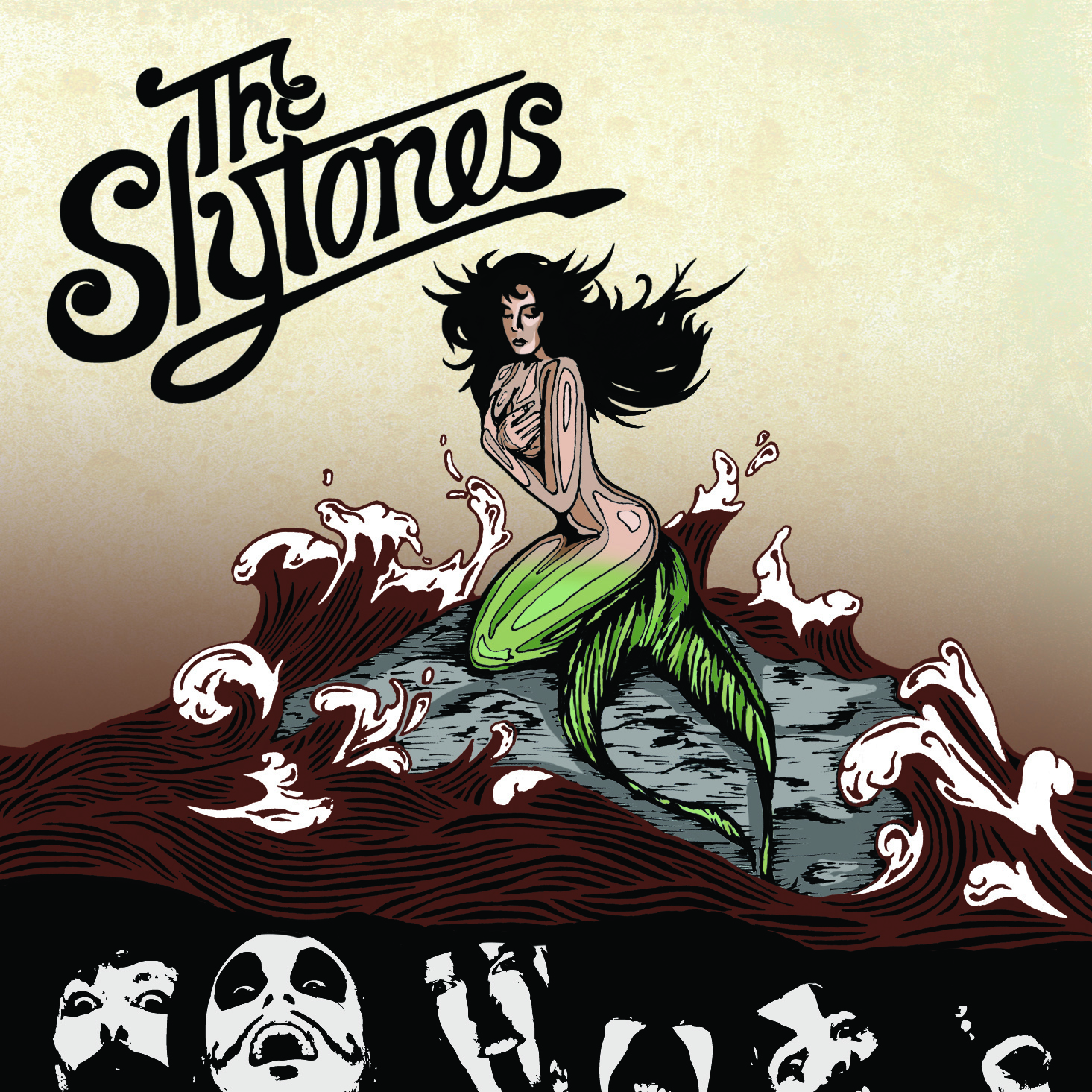
Few changes that the client wanted. Fin colour, slight change to mermaids face, bigger type, website 'theslytones.com'


Thursday, 8 March 2012
Cover.
The cover so far. Its looking alright I think. Need to move over some design ideas to the website.



Instead of the clouds in the background which didn't really compliment the design I thought I would encorparate some aspects of the last design that I did for the slytones.
The band acutally wanted some similiar design ideas, "Kind of want it to reflect a few themes from the last ep's artwork you did." So using the birds link the two designs together.
Saturday, 18 February 2012
Friday, 17 February 2012
Clouds and Time
Client wanted more detail on the hour glass so I added the slats down the side which they usually have. Also thought I could fill up some of the negative space with clouds.


Clouds and new hour glass together.

Thursday, 16 February 2012
Red Sea
Added all the info on the back cover, legal stuff etc. Spoke to the client and they are ADAMANT on the red sea which I don't think looks as god but hay ho, life of a designer I guess. Still deciding on type for the song titles, some different Ideas shown below.


FACE
Finally changed the face. It took me a long time to make her not look like Michael Jackson. But the end result looks better than a blank face.


Monday, 13 February 2012


Friday, 10 February 2012
Logo
THe client didn't want drop shadow and wanted type less weighty.
Initial Sketches


Monday, 6 February 2012
Cover
Putting the latest logo together with the illustraion. The client wanted the bands faces on the front cover because there face paint is a strong part of their brand and USP.

Meeting with the client, they decided that they wanted red sea and still weren't happy with the current logo.
Also I need to add a face to the mermaid.
Wednesday, 1 February 2012
Logo
Tried to develop the log a bit further, I think the "The" looks good and the drop shadow gives it more depth.

Thursday, 26 January 2012
Cover
Trying even more colours with the right size of a Ep cover with the logo to see the relationship between type and image.
Wednesday, 25 January 2012
Tuesday, 24 January 2012

Monday, 23 January 2012


Saturday, 21 January 2012
Inverted
Experimenting on how these two logos work on a black background. The type still looks messy and needs work done to it.


Subscribe to:
Posts (Atom)