Friday, 30 March 2012
Joe Wilson
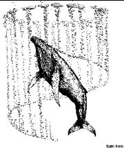
Joe wilsons illustration style is really cool and I like the textured backgrounds and colours he uses. The hand drawn type is also cool.
Thursday, 29 March 2012
Design Context Presentation 2
Feedback from the presentation brought up some valid points to consider for my DC publication,
- Trying to fit things into the 2 chapters
- Things cross over, should be branding from the small things to the building if appicable.
- Rangers and areas of Packaging - examples rather than sections.
- Need to explain what I mean about the brand, the whole feeling, ambience, look and feel of an environment.
- Explain my focus is on bespoke, high spec, high budget, high concept, innovative design. Not boring commercial crap.
Photography set Up.
Mark and I were talking today about the best way to shoot the 'individual pages' work so we didn't have to change to much in between the different styles and layouts. We thought that a corner set up a bit like the images below would make it so that we wouldn't have to change the background all the time.
Wednesday, 28 March 2012
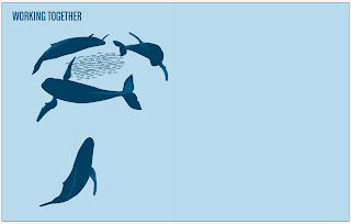
Bubble Net Info Graphic
Format
I want by Design context publication to have and interesting layout and perhaps involve big type like the spread below. I think it will work well with a simple colour palette perhaps 2 colours to signify chapters.
Fish Restaurant
Tuesday, 27 March 2012
'Human' Nuerons
This link leads to an article that explains that scientists have found out that Humpback whales brains contain a type of neurones that was previously thought to have been only found in Humans and great apes.
http://neurophilosophy.wordpress.com/2006/11/27/the-brain-of-the-humpback-whale-contains-human-neurons/
http://neurophilosophy.wordpress.com/2006/11/27/the-brain-of-the-humpback-whale-contains-human-neurons/
Monday, 26 March 2012
Bubble Net Info Graphic
For the bubble net info graphic for the 2nd chapter I want to communicate the humpbacks technique of fishing. Here is a sketch I did of initial ideas.
Big Kahuna
I was thinking about how to package the dvds in a different and original way when I thought of Big Kahuna Burger which is a fictional burger restaurant which appears in 4 of Tarantinos films.
Here is a link to more info about Big Kahuna http://www.tarantino.info/wiki/index.php/Big_Kahuna_Burger
I thought I could package the dvds in a paper bag like this, seen in From Dusk Till Dawn.
Tarantino fans who would be buying the box set would love this quirky packaging.
Sunday, 25 March 2012
Chapter One
Chapter one so far. amendments to the type and image hierarchy and also the info graphics are inside.
Size info graphic
The comparison to the bus wasn't working so I thought I would compare it to another big animal which people always think of being big which is a Great white Shark. I also added humans holding hands to show how long a blue whale is. Also added the weight aspect to the info graphic to give more of a comparison of their size.
Age Info graphic
After producing the info graphic I thought that it needed something more. So I decided to show how long 200 years is through a time line of what a bowhead alive today would of lived through. Showing specific dates to really communicate the their lengthy life span
Time line at bottom.
Saturday, 24 March 2012
Size Comparison
Found these size comparison charts on line which is something I want to do in an info graphic. I think they work well but having different animals on multiple lines next together doesn't show of the the size as much as when things are in one line.
The Competition
Here are some other re designs I found online, some interesting Ideas. I think the second one is good, it also used an element which I was going to incorporate in my design which was the cogs and machinery which appears in the book.
This is what the brief asks the design to be.
This is what the brief asks the design to be.
- have an imaginative concept and original interpretation of the brief
- be competently executed with strong use of typography
- appeal to a contemporary readership
- show a good understanding of the marketplace
- have a point of difference from the many other book covers it is competing against
Friday, 23 March 2012
Placement page
Organisation Station
We organised everyones submission proposal sheets for the year book. We then went through all of them and put them into the croups that best represented their work. Then made a list of what projects with in everyones proposals would work best in the showcase and individual pages. Now we are in the process of speaking to everyone individually to clarify what we aim to do and confirm what they want in the year book and what we need from them. LONG........ but good to speak to everyone so they are all happy with the end product. Feed back was good from the categorisation Idea and also the gallery page.
Subscribe to:
Posts (Atom)


